Adding delightful spot illustrations to Babycenter’s brand
Product design > Babycenter case study
Synopsis
Turo is the largest peer to peer car sharing company in the US based out of San Francisco. It serves as a marketplace for people who own cars (hosts) to share their cars with people who need a car (guests).
During my 2 year tenure at Babycenter, I designed a lot of spot illustrations for various features.
Details
Team: Mobile
Platforms: IOS/ Android
Role: Senior Product Designer
Skils: Illustration
Company Problem
When I joined Babycenter, their two apps leveraged mostly photography and simple UI icons in the brand language. A few one-off illustrations had been made for some features, but the product was mostly text.
Guiding design principles
Organic-looking instead of geometric
I drew by sketching and using the pen tool, rather than building shapes to make geometric and perfect looking figures. This to me seemed important since Babycenter’s subject matter was established around helping mom navigate through her journey of pregnancy, something that is very personal and unique. I felt the organic nature of life, of pregnancy was better described in this fashion.
Leveraging the existing brand color palette
Babycenter cared a lot about adhering to brand colors, so I made sure to use that as my guide. There were some cases where I needed more color, but still tried to keep the colors all feeling like the same family.
Representing other ethnicities
During usability testing, Babycenter had received feedback from mothers of color that they didn’t feel represented in the brand’s photography choices, most of which was stock photography. Once we learned this, I made sure to incorporate different ethnicities when it made sense to.

Babycenter fruit stickers
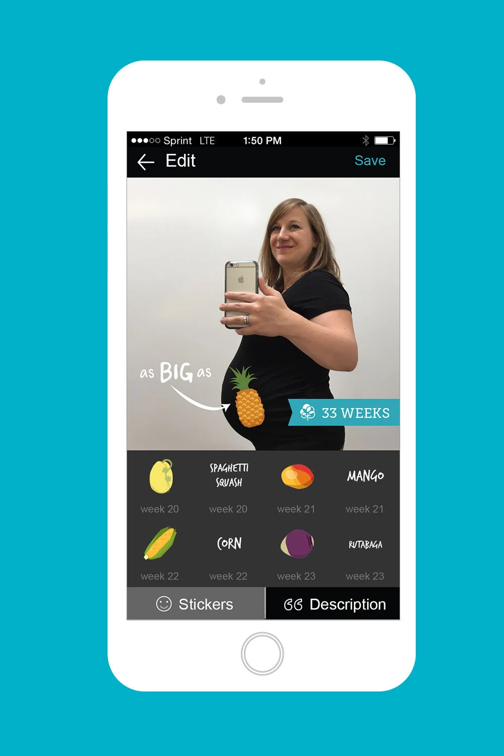
One of Babycenter’s most popular tools was the bumpie camera and gallery tool. Each week, a mom-to-be could snap a photo of her bump growing and save it in her gallery. I created fruit stickers that moms could use over top of their photos to demonstrate how large the baby was.
Here are a few of the 36 fruit and veggie illustrations I made for the bumpie tool

Baby milestones tool
In an effort to get mom to share user generated content and promote Babycenter, we created a baby gallery feature within the app and I illustrated a branded milestones sticker set.


