Host category ratings
Product design > Turo case studies > Host category ratings
Synopsis
What started as a response to Covid-19, turned into an improved method of gathering guest feedback about their trips.
Details
Team: Host design
Platforms: IOS, Android, Web
Role: Lead Product Designer
Team(s): 2 designers, 2 product managers, 2 engineering teams
Timeline: 3 years (due to de-prioritization)
Skils: UX/UI, wireframing, prototyping, usability testing, research synthesis, mentoring and leading,
Business problem:
Covid-19 made hosts and guests anxious about getting into cars
It was the early days of Covid-19 and Turo needed to ensure hosts were keeping cars clean and safe
We awarded hosts a badge for completing special training on how to clean and sanitize their cars
The current rating system only captured an overall 5-star rating
We wanted to keep hosts accountable for maintaining well cleaned cars
Design problem
How might we infuse more trust for guests in our platform during and after Covid-19?
Strategy
Capture more structured category data on trips
Coach hosts on how to improve
Display structured categories to guests to help them make better comparisons
Do it in a way that does not reduce overall share of rated trips (don’t add too much friction that they don’t complete the rating process)
Research
Design audit
The current review form was made up of
Overall rating (required)
Structured “pill” responses based off rating
Written public review
Private messages to host
Private message to Turo
Because ratings were a key indicator of guest retention, it was very important that we not harm the overall share of rated trips. The business did not want to create too much friction that guests stopped rating trips all together.
Research
Competitive analysis
Some examples focused on the overall rating and a few structured options, others only had category ratings, usually all listed out in one page.
Wireframes
Concept one
Keep existing screen and add one page with a list of star ratings
Pros:
We preserve overall rating
Optimize for efficiency with category ratings all on one page
Cons:
Visual overload
Lacks focus
Wireframes
Concept two
Keep existing screen and add two pages of category ratings. Page one is about the host, page two is about the car.
Pros:
We preserve overall rating
Group categories in logical pages
Slightly less cognitive load than option one.
Cons:
Still lacks focus
Wireframes
Concept three
Keep existing screen and add a guided flow, one per category.
Pros:
We preserve overall rating
Each category receives its own focused page
Lower cognitive load
Cons:
More friction for each page
Usability testing
We tested two concepts with non-users set in the context of being a Turo Guest and wanted to measure:
Which design felt faster to use
Which design was easier to comprehend
Which design was preferred overall
Uncover any pain points or areas of confusion
Concept one
Very view people thought to tap the tooltips explaining what each category was
I did however notice a lot of scrolling up and down. The progressive disclosure of the sub categories appeared to surprise the user and create a bit of a jarring experience
Most did not notice the skip, so they thought this version was mandatory.
Tied with concept two for what was perceptibly faster
Concept two
Some liked the focus of the page
Some liked the descriptions laid out in-line
Some called out the progress bar and said they really appreciated that.
Everyone noticed skip and liked that it wasn’t mandatory
Tied with concept one for what was perceptibly faster
4/6 people said concept two was easier to understand
4/6 people preferred option two overall
What was confusing?
Nailing the primary navigation
Re-designing the entire app to accommodate a host’s work flow covered so much surface area. We decided early on that we would focus on high level information architecture and show the most important features and work flows for hosts.
We discovered that there were promising ideas with two different tab directions.
Option one
The first direction leveraged a host Dashboard, that would have a high-level view of their business. It would serve as a way to deep link into areas that required attention, such as new booking notifications, claim statuses, etc.
Option two
The second direction prioritized two high-frequency tasks for hosts, speaking to guests (inbox) and planning their schedule.
Divvying up the work
Each designer took one tab and explored multiple concepts for each of these tab structures.
I explored the concept of the Dashboard and the stats page
Helen Li took messaging
Michael Noh explored a host-level calendar
Matt Fukuda pitched in on vehicles
More brainstorms
It was at this point that we felt we we could now dive deep into our respective areas. Each designer lead a brainstorm using different methodologies. It was really interesting to see the types of outcomes of each methodology. We certainly learned from each other during this rapid ideation phase.
Michael lead a writing exercise and coded responses, Helen led a priorities matrix, and I lead a sticky brainstorm
Design audit
By changing our tab structure, I was tasked with fitting a ton of high level information into one new tab.
Performance tab
Earnings tab
Calendar / Trips
Host Dashboard concepts
I realized pretty quickly just how much stuff we had to pack into the dashboard.
I knew I had to pack a lot into the dashboard, so after synthesizing the ideas from the sticky brainstorm, I came up with a system for different modular sections.
I also explored horizontal scrolling as a means to add more content in the same section. I took a lot of inspiration from the Clarity Money app.
Concept one: Day at a glance view
We highlighted high frequency tasks, important statuses, education and tips to become a better host, and the host’s earnings.
In this concept, I prioritized the most immediate actions and statuses toward the top and gradually the modules became less and less immediate.
I explored multiple modules of “most recent” activity that could deep link the host deeper into the product.
Concept two: Performance oriented view
This concept prioritizes some of the performance metrics that Turo cares about and adds more business performance metrics hosts care about, such as a trip fulfillment funnel, earnings, and their fleet’s utilization rate.
A simplified and truncated view of Day at a glance concept
Concept three: Act, Monitor, Learn view
We tried breaking up some of the concepts from the previous two ideas and organized them in tabs. I continued to rev on this idea, as it gave me more opportunities to organize information and make things easier to find. We decided to remove the tips tab and focuse on “today” and “performance.
So many more iterations…
In all these explorations, I was searching for the perfect balance between showing high level information and then allowing a host to drill in to see more, either to a new page, a modal, or a bottom sheet view.
Prototyping and testing
Each designer had two final prototypes to match the two navigation concepts. Our research lead held remote interviews and usability testing with new hosts who had 2-9 trips and fleet hosts with 5-19 trips.
Insight Synthesis
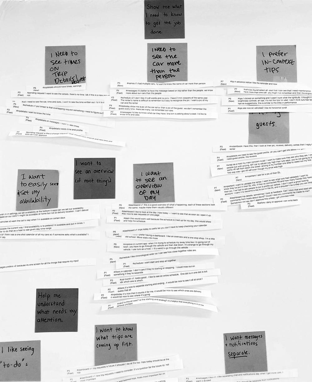
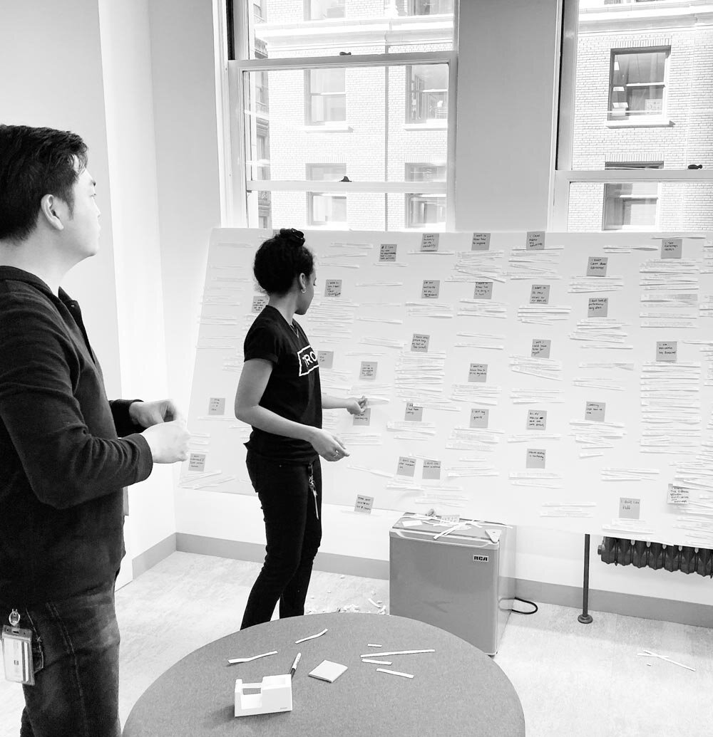
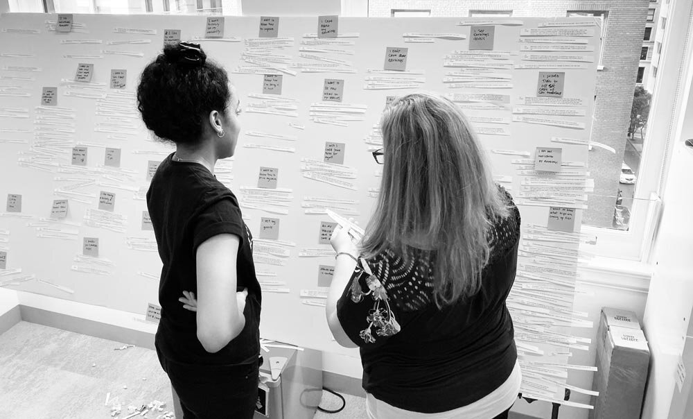
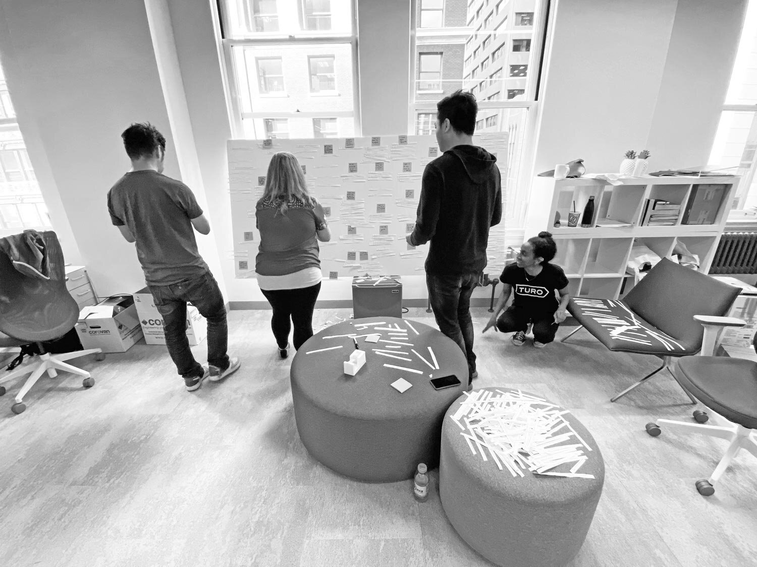
Because we had such a large surface area to cover by testing 8 different prototypes, we uncovered so many insights that the team pitched in to synthesize the data. Ansaria led an affinity diagram exercise that took 2 days.
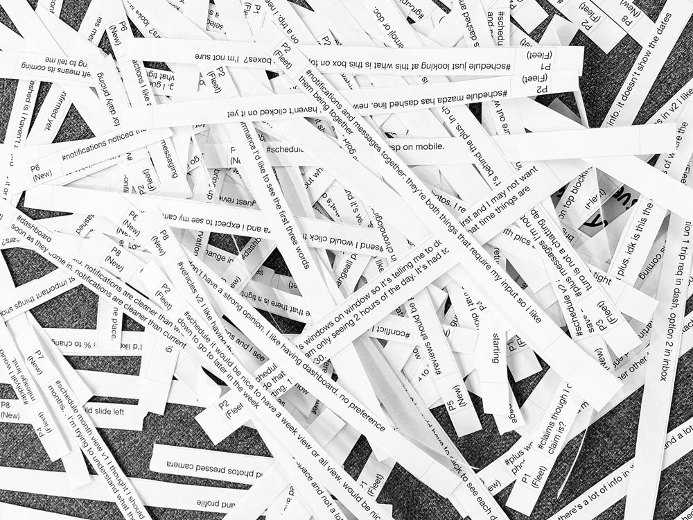
High level Insights
Prioritize actions and messaging the helps host manage their on-going trips and schedule first.
As Turo, we constantly want to put new messages in front of hosts to ensure they are performing at high standards. During the research this came in different forms.
Dashboard version where we prioritized status and performance above their trips today and calendar
Inbox version where we prioritized booking requests
All participants appreciated navigating to fewer screens to complete tasks because it saved time.
Most fleet host participants appreciated reminders to do infrequent actions like maintenance or un-snoozing a car.
Most participants appreciated being able to see the current status and a history of their performance, vehicles, and claims in the app.
Phase one outcome
We managed to complete our vision and research just in time to share with the executive team and product team before roadmap planning.
We influenced an entire team’s 2020 roadmap
We were thrilled to find that by presenting our vision in a tangible format, we actually were able to influence the 2020 product roadmap. One of our host cross functional teams was charged with improving host efficiency and several of the ideas from this vision project and the messaging vision project I lead earlier in the year would go on to influence what projects they would commit to building.
We raised the bar for the entire design team
Host mode was the first vision project that went through the entire double diamond design process. By completing this as a team, we set an example for other designers and teams to follow.
We came away with powerful insights we can still use today
The high level insights that ansaria uncovered help us make decisions in all of our projects.
What we could have done better
More collaboration with Product and engineering
While most reactions to the vision and presentation were positive, there was also some concern that design spent all this time on a vision but did not involve product or engineering. We realized if we involved our cross functional counterparts more we may have even more success influencing roadmap discussions in the future.
Creating cohesive concepts
Because we were so early in the wireframing stages when we tested, we didn’t have the time to make all of our prototypes feel like one app and tell one narrative. This really came out in the styling we chose to use, the type hierarchy, and even how a host accesses trips. If we had more time, we could have gotten there, but this project was about getting proof of concept out into hosts hands and getting signal that our vision was heading in the right direction.


